Navigation auf uzh.ch
Navigation auf uzh.ch

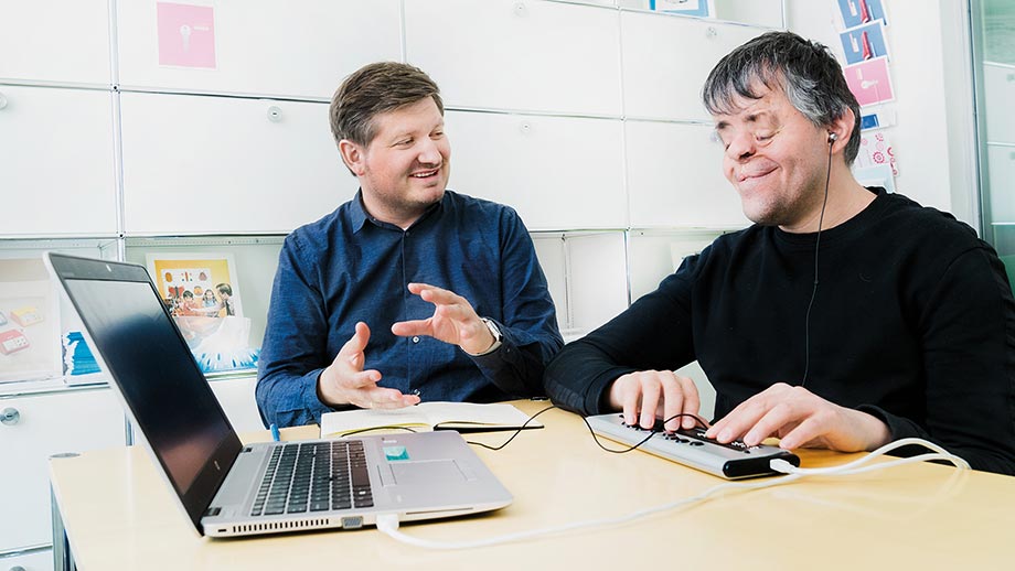
Whether you need rapid access to information or want to order goods online or pay bills via e-banking, the internet is an incredibly practical tool that makes many everyday tasks a lot easier. But not everyone benefits equally from the boon of digital technology. Daniele Corciulo, for example, who joined the UZH Disability Office last November, finds that surfing the internet can quickly become a frustrating obstacle course. He’s been blind since birth. To be able to work at the computer he uses a refreshable braille display in conjunction with a screen reader, a program that reads out the content and functions to enable him to navigate a website.
But even with these practical aids, browsing the web can be problematic. “I navigate websites linearly, from top to bottom,” explains Daniele Corciulo. To do this he uses various keystroke combinations recognized by the screen reader. This only works if a site is well structured and the content is presented in a way the screen reader can read and reproduce. But that’s not always the case – not by a long shot. He regularly finds himself surfing into a dead end. In many cases it’s not just text that is hard or impossible to access, but graphics, tables and images as well. How are blind people supposed to use visual tests like captchas to prove they’re not bots?
“Many website operators simply aren’t aware of the problems faced by disabled people using the internet,” says Benjamin Börner, head of the UZH Disability Office. The obstacles to surfing the web cause people like Daniele Corciulo a lot of frustration and cost them additional time and money. Not only that, but they are dependent on the help of others whenever they get stuck on a non-accessible site. “This is also an issue for many older people, a section of the population that we know has plenty of money,” points out Benjamin Börner. “That’s a waste of economic potential too.”
At UZH as well, many websites are hard to access for users with an impairment. “As things stand, for example, it’s incredibly difficult for these people to enroll for a study program or apply for a job at the University of Zurich,” says Börner. “And they have to navigate a whole range of obstacles to get information on things as basic as semester fees.”
But that’s about to change. As part of its Diversity Policy, launched in 2018, UZH wants to make information more accessible. For this reason, for some time now the Disability Office has been providing support and services to University institutes and departments. Its staff test the accessibility of websites and apps, identifying specific problems and helping to resolve them.
Daniele Corciulo already has plenty of experience in this field. Before joining UZH he spent several years at the Access for All foundation testing internet sites and advising web designers.
In addition to the problems faced by people who are blind or visually impaired, his work at Access for All also addressed the challenges of people who are mute or hard of hearing, or who have a motor or cognitive impairment. This knowledge now informs his advisory work at UZH and the workshops organized on the subject by the Disability Office.
Concrete guidance is available in the form of the Web Content Accessibility Guidelines (WCAG 2.0), a set of recommendations issued by the World Wide Web Consortium (W3C). Börner and Corciulo agree that these guidelines should be the first point of reference for web designers aiming to create accessible websites.
Besides a clear structure and easily accessible images, tables and graphics, it’s also important for accessible websites to present content accessible via two different senses (visual, auditory or tactile). “For example, red and green indicators showing whether a vacation apartment is vacant or booked can’t be read by someone who’s color-blind,” explains Benjamin Börner. “To make information more accessible you always need to present it in a second form as well, for example audio or text-based, for people who rely on another sense.”
At first glance all the guidelines designed to make the internet more accessible seem difficult and complicated. But Daniele Corciulo says that this isn’t actually the case, and that a lot can be achieved with small improvements. He’s now showing University webmasters how to do this in practice.